BLOGGER TEMPLATES AND TWITTER BACKGROUNDS »

Thursday, 25 February 2010

Evaluation - Advanced Portfolio

Fatima Adam


Evaluation
Erica Shine - I Will Wait For You

For our project we decided to produce a music video. There was three of us who worked on this project, I worked alongside Grace Rewaj and Elizabeth Ann Robinson. We managed to split the work evenly between us so that each of us could participate in every part of the project. Therefore I contributed to all areas of the project which was the filming, the editing which was mostly done by Elizabeth as she was unavailable for the filming days however we did do a fair share amount of work in this, I also took the pictures for the ancillary task, and worked alongside Grace Rewaj to make the 4 sided Album cover whilst Elizabeth Ann Robinson made the magazine cover. Our target audience was from 15-25yrs olds who would watch this music video, however we do feel that it the video would be watched by an older group over 25yrs. This product would appeal to them because it is modern and it is based on a female singer songwriter, who is singing about how someone within that age range might feel.

In what ways does your media product, use, develop or challenge forms and conventions of real media products?

The genre for our music video is female singer/songwriter, our main aim was to focus on the her throughout the video to introduce the audience to the new artist. It was vital to use the typical elements for this genre in order to call her a female singer/songwriter and also not to loose our objective."Genre is created through repetition and recognition leading to anticipation and expectation." (G.Burton 2000) For our video we used different locations, we had the park/woods scene where we used the snow to our advantage to add effect to the video, we had the flashbacks of the images of the couple and flashbacks of videos of the couple, the different weathers shows that it was throughout a period of time which is what the song is about, and finally we had a photo frame scene which the artist sang through, this was a very unique idea as it is rarely used in other videos. We wanted to test the typical elements without changing the whole purpose of the video, at first we felt that the frame may not work, but gradually as the editing was completed we agreed that the photo frame fit in well with the rest of the video. "Unexpected and the familiar" (G.Burton) which is exactly what we did with the typical locations such as the park and the woods, but added our own twist to it with the photo frame and the flashbacks I think our innovations were likely to prove successful as it is still familiar enough, as not to frighten the audience away but different enough to offer the audience something new. overall the feedback we got from our audience was mainly positive, which shows that our music video worked well as a whole. Andrew Goodwin a media theorist has identified a number of key features in a music video they are:
- A relationship between the lyrics and visuals,
- A relationship between the music and visuals,
- Genre related style and iconography present,
- Multiple close ups of main artist or vocalist.
Furthermore I believe that our music video meets all the key features as it is a well established Music video.


Here are a couple of inspirational videos and images from existing female artists;

Leona Lewis
Taylor Swift
Pixie Lott
 They're all the main focus of their album.

Alesha Dixon - To Love Again


How effective is the combination of your main product and ancillary texts?
Our brand image is simple yet fresh and elegant which is a great way of describing our artist. The logo we decided to use was our artists name 'Erica Shine' we used the renaissance font which is very stylish. We kept it simple because we felt that after taking a risk with the photo frame, for our ancillary task we would use our artist as the main focus to introduce her to the audience, so for our album cover and magazine adverts we used images of her throughout instead of other distractions. We have maintained a brand image across the product firstly for our album cover we edited and used a spotlight on our artist to make her the main focus and everything else around her dull which foreshadows the meaning of the song as it is about waiting for that special person. For the back cover we used black and a peach colour which shows a bit of happiness and sadness in one we also had a hand clock put on the back of the cover, the connotations for this was 'I will wait for you' which is the name of the song. For our magazine cover we used the opposite we decided to keep that bright and simple. We took many pictures which we then dedicated a whole page in the album to Erica Shine.

This is our brand image...

The kind of media institution that may distribute our media product could be any of 'the big four' they are the big music companies around the world. I think the kind that may distribute ours would be EMI. The EMI Group (Electric & Musical Industries Ltd.) is a British music company. It is the fourth-largest business group, making it one of the "big four" record companies. Branding is a very powerful component for a company. The brand must have a logo to make branding easier and more possible. The consumers decide if they will buy a product or use a service based on how they view the brand. The brand itself tells us or let us imagine how good or bad the product is. All that brand promotion and advertising really do tell us how great a brand can be. Once a customer likes your brand they will definitely come back for repeated services or products.

We got feedback from our audience on our brand image:
Can you sum up the brand image of this album in one word?
•Elegant
•Stylish
•Graceful

Do you think the album cover fits in with the brand image of the video?
•Yes
•Yes
•No

I used Slideshare to present my ancillary task i think this is a great way to present the images of the album cover and the magazine cover.

What have you learnt from your audience feedback?
Our main audience is ages from 15-25. This is because the artist is a female singer/songwriter who is also young. Furthermore young people listen to music the most of there time downloading or buying songs.UK Music is pleased to present the results of its annual academic survey investigating the music consumption behaviour and experience of young people aged 15-25. Carried out in spring 2009 by the University Of Hertfordshire, the online survey was completed by more than 1,800 young people throughout the UK. Statistics have shown "Music remains the most valued form of entertainment" - Evidence of the value of TSL
"Ownership of music is hugely important" - Evidence of the value of downloaded music
"61% said they download music using P2P networks or torrent trackers" - Evidence that young people don't want to pay for music.
Our secondary audience may be people from the ages of 26- 30 yrs.
This is the feedback we got back on our music video and ancillary task from people aged 15-25:
Music Video Feedback

Do you think the product is typical of a music video?
• Yes
• Yes
• No
• Yes
• Yes

Does anything make it different or does it stand out from the typical? How?
• It stands out from the typical because of the photo frame.
• It is different because the snow effect and photo frame is very rare
• The pace is typical and it works well with the song, but the photo frame isn’t it stands out than the rest
• The snow effect makes it different
• The photo frame makes it different because it isn’t common to find that in music videos.

Does it work?
• Yes because it tells a story within the video.
• Yes
• Yes
• Yes
• No.

Name two interesting elements from the video?
• The flashbacks, the snow effect
• Flashbacks, Frame
• Frame, Location
• Flashbacks, Location

Do you think the video fits well with the song?
• Yes
• Yes
• No
• Yes
• Yes

Do you think the pace of the video is typical of this kind of product?
• Yes. Because it is a slow song the slow pace works well with it
• I think the pace of the video is typical of this kind of product as they are both slow
• I think the pace of the video could have been a bit quicker however I do feel that everything else in the video fit well together
• Because the song is slow the pace of the video works well with it
• Yes the pace works well together

How do you think the video can be improved?
•I think it all fits well and no improvement is needed
•More scene variation
•Overall I think it was a great product
•Overall it worked well together
•Less of the frame scene

Ancillary Task Feedback
Do you think the product are typical of magazines and album covers/if so in what ways is it similar?
•Yes because it is simple like the artist
•Yes because the content is the same as what you would get on a normal album or magazine
•It is typical
Does anything make it different or does it stand out from the typical?How?
•Yes. The font is very elegant
•The colour scheme is not typical according to the artist in this video as the front cover is dark
•Yes.The front cover shows that the artist is the main focus

Does it work?
Yes
Yes
Yes
Name two interesting elements from the ancillary tasks?
•The colour scheme and font
•The pictures and font
•The layout and Pictures
Could this product be stronger? If so how?
•Yes. More colour
•No
•No

Can you sum up the brand image of this album in one word?
•Elegant
•Stylish
•Graceful
Do you think the album cover fits in with the brand image of the video?
•Yes
•Yes
•No

Would you be tempted to buy this album?
•Yes
•Yes
•Yes

90% said that they would be tempted to buy the album
10% said they wouldn't the statistics show that many people would want to buy the album.


To gather our information from our target audience we gave out questionnaires. We used blogger to display our feedback and other research. And we used Microsoft Excel to present our information.


How did you use media technologies in the construction, research, planning and evaluation stages?
Planning
For our planning we sketched out our storyboard from this we then used a video camera to film it and Imovie to create an animatic storyboard, after that we uploaded it onto our blog. We each drew our own album covers and magazine covers for our ancillary task and put our best ideas forward onto our final product. We also put our song 'I Will Wait For You' on our blog by using Imovie. We also planned out a schedule for when we would start filming outside of college time which we did on the 3rd of January 2010 and 20th January 2010.

Research
For our research we used the Internet and additional sources such as books to gather information on music videos, we researched about branding and other existing artists which we were inspired by, we also researched on genres, institution, our target audience which would best suit this product, camera angles, cinematography, narrative etc

Construction
Firstly we began by filming, for this we used a video camera, a tripod, batteries, a tape, and a stills camera to take the pictures for the flashbacks. I took still pictures of the flashbacks, and a clip of the artist and the male which was used in our video also as a flashback. On the 3rd of January 2010 we did more filming, I filmed our artist (Grace Rewaj) as Erica Shine for three hours constant in the snow which we used to our advantage, we filmed most of it in the park and the woods. We then had another day which was the 20th of January 2010 which we filmed in college, this is when we did the photo frame scene and took more pictures of our artist for our ancillary task. We used a apple mac computer which I was familiar with because I had used it for my AS coursework therefore I was familiar with the features on it, the softwares I was not so familiar with were final cut express, Indesign, and Photoshop however as began using them i began knowing how to cut between scenes in final cut express how to use colour grade and add transitions in between each scene in order to make it flow, I also learnt how to link the music with the clips at the correct times. With final cut express it was very challenging and at times I felt that as i was editing it I made a couple of mistakes but as I started using it continually i got used to it and was able to edit it without making any mistakes. Overall i enjoyed using final cut express as it was a challenge and it was something new that turned out to make our video quite appealing. With Photoshop and Indesign as I played around with it using the different effects I became more confident in them both. We chose our music from a copyright website where music was free to download and use. We also got our font from a website because we wanted it to look different and unique (http://www.dafont.com/). Overall blogger was very useful as we were able to put all the information that we gathered onto here so it was easy to visualise.
These are a couple of the shots from the music video:


  This is an image that was used in the video of the couple. (Flashback)
These are the technologies that were used to film and edit our media project with:

Apple Mac Computer
Tripod

Stills Camera


Camcorder

There wer many advantages and disadvantages to using the technologies and softwares:
Advantages
- Very easy to handle
- We were able to take it to many locations
- Long last on battery life


Disadvantages
- Tripod wasn't very effective
- Final cut express was difficult to use at first
- Photoshop was also a little difficult to use at first


and these are the softwares we used to produce the whole music video along with the album cover and magazine cover:


This is Final Cut Express we used this software to edit and complete our music video.


We used Photoshop to make any adjustments to the magazine and album cover.


And Finally we used inDesign to create the magazine and album cover.


Conclusion
In conclusion I feel that our product turned out well, we were able to edit it well and get the music to flow with the video along with the ancillary task, which we were able to achieve what we wanted by making the artist the protagonist, however even though there were a couple of downs with the final cut express we got used to it and in the end we were able to pull it all together. Overall I feel that my fair contributions in everything has made me confident in this area as I was able to gain skills and improve on them.

Sunday, 21 February 2010

Evaluation of 'I Will Wait For You'. Grace Rewaj


In my group I worked alongside Fatima Adam and Elizabeth Ann Robinson. Our project was to make a music video to the song, ‘I Will Wait for You’ by a female solo singer named Erica Shine. Myself and Fatima did all of the filming for the outdoor scenes in our video, whilst Elizabeth did the vast majority of the editing as she couldn’t make it to the filming shoots. For our ancillary tasks, Fatima and I worked solely on the album cover, back page, and middle pages; whilst Elizabeth worked on our magazine advertisement for the album.


In what ways does your media product use, develop or challenge forms and conventions of real media products?

The Genre of our music video and ancillary tasks is a female solo pop artist, trying to portray to the audience a ‘clean-cut’ image, in which the artist appears young, fresh, sweet and innocent. This is a typical convention for this type of genre, and we haven’t challenged the common aspects used in this respect, as we have also intended to create this image, as it was the look that we wanted to push to the audience for our artist. We have used lots of different shots in our video to establish our artist, and our costume for our artist helps to put across the right image. This is all part of our mise on scene, and the fact that there is snowy scenery helps to create the ‘fresh’ and ‘clean’ look. Here are some of our shots of the artist:

This is a close up shot. As you an see, we
have used mise en scene to our advantage
and our artist does not wear over-powering
make-up for the video, and wearing a


flowery scarf helps to put across the ‘innocent’ and quite ‘girly’ image that artists such as Taylor Swift often portray within the music industry. We have also used shots such as long and medium shots too to show our artist as music videos tend not to stick to the same shots all the time so that the audience doesn’t get bored. Here are some other shots we have used:


Extreme long shot


Over the shoulder shot/POV


Medium shot.


All of these different shots do not really challenge the forms and conventions of real media products, however, our video consisted of two different locations, and our other location was quite creative. I was quite skeptical about this to begin with as it was an idea to have my face, as the artist, singing through a photo frame, and I thought it may have been too random for our piece, which has quite a mellow, sad feeling to it. However, when the video came together I feel it fitted in really well as in our video; we fitted in some flashbacks of the past relationship the artist is singing about, and these photographic flashbacks linked into the photo frame idea. This made our video more interesting and one persons comment within our target audience of 15-25 year olds, said it was very creative and worked really well. This type of shot also helps our video in challenging the typical conventions of a music video. Here is a still shot of one of the flashbacks and of the photo frame idea that links to it:


Flash back of happier times.


The photo frame idea


By including shots such as these, we are aiming at keeping the audience interested in the video and, offering them something different from what they would normally be used to watching.

In my research I mentioned Taylor Swift's song 'White Horse'. The link below enables you to watch this video to see how we have incorporated this style into our video, but with our own unique twist to make our product challenge the conventions of a real music product.

http://www.youtube.com/watch?v=D1Xr-JFLxik

How effective is the combination of your main product and ancillary texts?

I feel we have stuck to the genre well, whilst adding our own twist to it with the close up of the artist in the photo frame. Our ancillary tasks, I feel worked really well and established our creativity and design to express our brand image. From our audience feedback, you can see that our audience thought that our front cover was simple, yet effective, which is what we was hoping to achieve. The use of the spotlight, in which I moved around and changed the size of etc, was used to focus on our artist, and I put an effect on the edges to make them appear gradually darker and darker in order to make the colours worn by the artist stand out more. Below is one of Taylor Swifts some album covers. Taylor Swifts brand image is very similar to one in which we were trying to establish in our work. This album cover is like ours in many ways, as the hair of the artist is quite flowing and we also have a clear shot of the young, female artist.


Here is a shot of our album cover:


As you can see we are trying to create a similar ideology for our audience. We want to create the ideology for the audience that our artist is a young, fresh, female artist with a unique style. We are trying to achieve the 'uniqueness' by making our picture quite quirky by having the artist as if they are lead down with the spotlight on them. 
Also, we included a lyrics page, a middle page and a back page.
Throughout all of these we had a continuous theme of colours, which consisted of red, black, and white. We also used our logo, which was simple and elegant. It was the name of our artist in the font, ‘renaissance’. It looked like this:

This logo helps to establish our brand image as it is repeated throughout our products. i feel through mise en scene, in our ancillary tasks, and in our video we have created a donminant ideology and a clear brand image for our artist successfully, in that she appears feminine, young and fresh.
Record labels such as Universal help to promote many various artists, and are extremely successful in doing so. They also include artists who have quite a ‘pop’ type of sound, therefore I feel they could be suitable for our artist and brand image in order to create a successful artist. I feel our main product works well along side our ancillary tasks as both help to astablich the genre and create a certain image, without contadicting each other in any way.

What have you learnt from your audience feedback?
In our audience feedback, we asked males and females throughout our main target audience of 16-25 year olds various questions about our music video and ancillary tasks. This age range was our target audience as it is proven that this group is the people that spend the most money on music products, which would therefore make our product a lot more profitable if we where to distribute it. Our secondary audience was 25-35 year olds. Our main target would be females, as they are more likely to buy the type of product that our brand is, however we did ask a varied audience for a wider opinion on our product. When creating our products, we thought about how we would try to match the audience's characteristics of the music genre we chose to work on, with the characteristics of our desired purchasers should we sell this product in real life. This is the demographics and psychogrphics of our audience. When looking at theories such as Maslows theory, we incorporated this into our product, focusing on things such as the social, self actualisation, and phsycological needs of our audience. As our target audience would be mainly young females aged 16-25, our song could relate to their needs of self identity, focusing on relationships etc, and they can relate to our artist and find a sense of escapism as they would feel that they have someone relating to them. This preserves a sense of 'social identity', according to Maslows theory, and so we can connect to the audience's feelings and can link to a sense of creativity through music.
Everyone who took part in our feedback thought that we had established our genre well and promoted our artist effectively in both our video, and our ancillary tasks. In the video, most people felt it was creative and different, especially breaking away from the usual music videos with our photo frame element. We had mixed opinions surrounding this idea; with some saying it was too ‘random’ when switching from the snowy scenes and others thinking it was extremely well thought up and a more interesting element to our video, that helped to brake away from the regular boundaries. However, everyone who participated did understand why it was there and where it linked in with the flashback images. Some people felt that the flow of our video could be a little slow placed at time, with certain shots being held on for a slightly bit longer than they thought it should have been. One person also commented saying that we could have varied our flashback images, and could have maybe had a few more photographs rather than repeating some; however they did comment on the colour grading of the flashbacks, and said that the black and white effect was a good idea to establish the images as past tense. Everyone who took part in our questionnaires believed that it had the main elements of a music video, and was like a typical music video in many ways, switching to and from all the different shots and showing the artist in different images and sceneries.
Our target audience also completed questionnaires for our ancillary tasks. They felt that the magazine advertisement ‘well placed’. They said that the images and the writing complemented each other by their placing as they worked really well together. Everyone said the same for our album pages too, saying they the pictures where well placed, with one person making a particular reference to the middle page, saying that they like the way lots of different pictures where all put together on the one page. Some people mentioned the boldness of our images, as they felt it showed our artist really well. They did say we could use a variety of more colours though, and a wider variety of costumes for the audience. Everybody felt that our brand was well presented through our products, creating the image we hoped to achieve for our artist and genre.


Here is how one person answered some of the questions on thir questionnare:

Video questionnaire:
Do you think the product is typical of music videos? If so in what ways is it similar?
Yes I think it is a typical music video as it shows the artist and the video represents the words of the song.

Does anything make it different or stand out from the typical? How?
I think that the photo frame image is a unique style.

Does it work? How?
Yes because it fits in with the flashbacks (photographs)

Name two interesting elements.
The photo frame and the snow scenery.

Do you think the video fits well with the song?
Yes as the song is quite sad and the video matches the mood of the song.

Do you think the pace of the video is typical of this kind of product?
Yes, most parts as it changes shots and images regularly.

How do you think it can be improved?
I think that sometimes the shots can be left too long and can feel slightly repetative. also the flash backs could be varied more as some are the same.

Ancillary task questions:
Do you think the product is typical of magazines and album covers? if so in what ways is it similar?
I think that they are typical becasue they clearly promote the artists style.
Does anything make it different or and stand out from the typical? How?
I think the middle page is creative and stands out as all the photographs are put together in a creative style.

Does it work? Why?
Yes. It clearly establishes artist and style.

Name 2 interesting elements from the ancillary tasks.
Bold cover, easily identify the artist.
Lyrics page to get to know the song.

Could the product be stronger? If so, how?
I feel it is already a strong product but could maybe vary colours and costumes more.

Can you sum up the brand image of this album in a short sentence?
Female solo artist, unique and own individual sound.

Do you think the album cover fits in with the brand image of the video?
Yes. Young female artist showing emotion through song and images etc.

Would you be tempted to buy this album?
I would have to hear more songs but I would be attracted to look at the album cover and images as they are catchy.

How did you use media technologies in the construction, research, planning and evaluation stages?
Reasearch: For the research part of our project, we used several different sources. We used the internet to look at different images and different videos for some inspiration on our genre. We also researched certain artists who fitted into this genre by using 'google' to find different informative websites. We also found out about the artist who sings the song we based our video on by using the internet. For our anllary task research, we looked at different real life magazine adverts and album covers etc. This helped to enhance our ideas for our own project.

Planning: We all worked together to plan various things for our product. Fist of all we had to plan our initial idea for our video on a story board. Although our ideas where refined to be made more suitable for our genre and in our opinion, made better, we all put together to make our intitiall thoughts. We had to plan and think about what type of song we was looking for and what mood we wanted our video to create towards the audience. Our whole video would then represent this ideology. We then had to decide on filming dates that where suitable for our group. Our first filming date was during the Christmas break on 3rd January, in which we had to make a list of all props that we would need etc as to not forget anything once it got to the day. We then filmed again on the 20th January within college time. Again we had to arrage what props we would need, in this case, the photo frame.
For our ancillary tasks we all sketched an ideo for the front cover etc of the album, and all made a sketch of the magazine advert. Our best ideas where then put into practise as we planned for our photos for these tasks. We wanted to clearly establish our artist, getting inspiration from albums such as these Leona Lewis albums

Construction: For the construction of our product, we had to begin with the filming of our video. I could not actually film any of the video itself as I was starring as the artist in the video, however, I did still learn how to use the video camera as I thought it would be helpful for me to recap on the skils that I learnt last year in my AS media studies. For the filming aspect of our product, we used a video camera; our tape, batteries, a tripod, and the connector used to keep the camera on the tripod in a stable position. We then used the AppleMac computers to go on 'final cut express', 'photoshop' and 'indesign' to create our video and ancillary tasks for real as finished products.
We had to use many different elements of photoshop for our music video, such as colour grading etc. This helps to make the image look more attractive and to stand out as a more 'eye-catching' piece. Also for the black and white images, we had to use the desaturate tool and make them look different to the rest of the video. We had to take out the sound from our original recording as then the artist would be miming to the underscoring sound of the real song. When using photoshop and indesign for our ancillary tasks, we has to use the pen tool to cut out various images, and to make the image more clear around the hair of the artist etc.  We had to change the lighting on our front cover to make the edges dark, and we varied the light used the 'spotlight' to enhance the focus on the artist. When using these different softwares, I feel that I started to learn alot more about photoshop and indesign as I had never used them before, however as I hadn't used final cut express until this year either, I found that slightly more difficult, and do feel I would have liked to spend abit more time on there to get used to it a little more. However, from when I did go on it, eventhough I struggled getting to grips with it, I did like the way it was set up even if I did find it a little daunting at times.
 Indesign
Photoshop
Final cut express

Our song was found on a copyright free music website, which includes many unsigned artists, and our logo font 'rennaisance' was found on the website http://www.dafont.com/, which consists of many different style of fonts to choose from. We have continually put our progress onto the blogger website, which has tracked our project ideas from beginning to end.

Summary
Overall, I feel that our product worked really well. I think that although we had some difficulties in some areas from time time we all worked well as a team to distribute the work that needed to be done, and have achieved an effective, well established product.

Saturday, 20 February 2010

Evaluation Elizabeth Ann Robinson

Evaluation: Advanced Portfolio

My project was Music Video production with promotional materials. I worked with Grace Rewaj and Fatima Adam. I contributed to all areas of the three tasks, but mainly I worked on the editing and the magazine advert, completing most of the editing, and all of the magazine advert.
Our target audience is 15-25 year olds, as this is the most common age for watching music videos. Our secondary audience was 25-35, as I think that this age group would also appreciate the product. Our products will appeal to our target audience because they are modern, bright and are made especially for this audience.
In what ways does your media product use, develop or challenge forms and conventions of real media products?


An example of an existing music video is Bat for Lashes- Daniel music video. This is a very creative music video with use of fast paced editing, iteresting lighting and unique dancing. This video, although of a similar genre to ours, is a complete contrast to the music video that we have produced. Although both contain the conventions of the genre( footage mainly of artist, more than one location, pace fitting with the song, a simple narrative and visuals complimenting the lyrics), they are both very different as finished products. The Bat for Lashes video, is much more creative, but is also a little quirky and strange. However this compliments their music well, and their brand image, which is a little strange. Below are some stills from the video, to illustrate the strange, yet creative and unique look:


Genre theories:
Andrew Goodwin, a media theorist has identified a number of key features in music videos, which are listed below:
A relationship between the lyrics and the visuals, with the visuals illustrating, amplifying or contradicting the lyrics.
A relationship between the music and the visuals, with the visuals illustrating, amplifying or contradicting the music.
Genre-related style and iconography present.
Multiple close-ups of the main artist or vocalist.
Voyeurism often plays a major part, especially in relation to females.
Intertextual references to other media texts may be present.

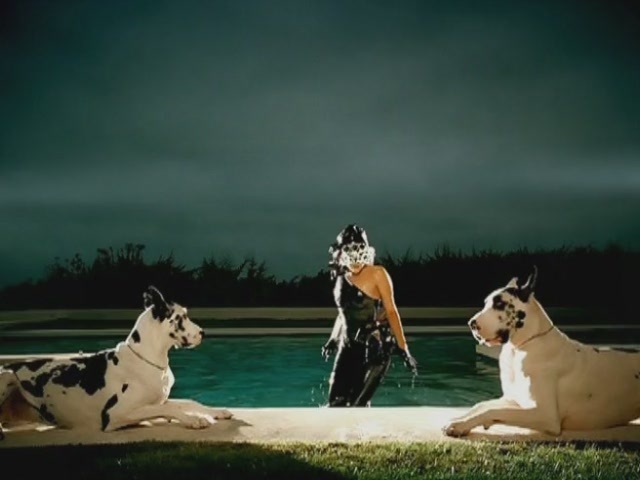
Our music video definitely follows the first point, our images are in sync with the song, and the lyrics are mimed. Also our footage is of a girl on her own, singing about missing someone, so this also establishes the relationship between the lyrics and the visuals. The music is of a slow tempo, and is acoustic, this is illustrated by bright visuals, that show an innocent character and are not too flashy, as to detract from the slow and steady pace of the song. Our music video also includes genre related style and iconography ( features the singer.songwriter, has different locations) see below for more.  Our music video does not contain voyeurism or intertextual references.
The music video genre consists of many things such as: short storylines, interesting editing and effects, unique camera shots, lots of footage of the artist(s) and instruments, where applicable. Also, music videos are usually fast paced, to keep the audience's interest and do not contain complicated storylines, as they only last for 3-5 minutes and so there is no time for development of a story. Within the music video genre there are many subgenres: rock, indie, singer-songwriter, hip hop, dance, pop and many more.The genre of our music video and promotional materials is female singer/songwriter. The conventions of this genre are: a focus on the singer/songwriter with most of the shots in the video being of the singer, although these videos sometimes have a narrative accompanying the singing shots. Of these conventions, we have used lots of shots of the singer/songwriter, and we have used two locations to add interest to this, a snowy scene in the woods, and a photo frame scene. We chose not to use a narrative in our video, but we have added photos of a couple together ( the singer and a male ) to illustrate the song. This also fits nicely with the photo frame shot, and continues the photograph element throughout the video. We added this new element, the photo frame, as it is very different from anything I have seen in a music video before, and it will hopefully interest the audience, and me a memorable feature from the video. Also, by doing something different, and challenging the conventions of
the genre, we are keeping the audience interested, and offering them ‘the same but different’ (G. Burton). I think our innovations were likely to prove successful because they are very different to existing music videos, but they are not too different as to disconnect our products from the genre. Our Ancillary tasks, the magazine advert and the CD cover, followed the conventions of the genre rather strictly, and are not as adventurous as the video. However, I feel that they do not need to be too different, and the photo frame shot, the different element, would not have made a good advert or CD cover. Our choices here worked effectively for our audiences, as they found these elements interesting, although some people disliked the photo frame idea, claiming it was ‘a bit random’, on the whole, our products were well liked. I feel that our products were different enough, but not too much as to displease the audience. In comparison to other music videos, our video is sucessful. However, it is not quite as interesting as some videos and lacks further interesting editing techniques, but these would have been very difficult to achieve without professional knowledge and experience, for example the kaleidoscope effect in Little Boots video for Remedy.
Stills from existing music videos:
Stills from various genres of music videos

How effective is the combination of your main products and ancillary texts?
Our brand image is a fresh, elegant, clean look that is bright and professional. The brand image for Erica Shine, the singer/songwriter, is innocent, young and slightly naive.
Our logo is simple and elegant. It is simply the name, Erica Shine, in the font, Renaissance, it looks elegant, and fits well with our brand image. It fits our brand image because it is simple, but looks professional. Also, it is not a cluttered logo, like some, which helps to keep with the fresh, young and innocent parts of the brand image.
We have maintained a brand image across our products, we have used the same font, Renaissance, throughout, and have stuck to the colours of red, white and black for our ancillary tasks and bright colours in our music video. We have also kept the mise en scene in the images simple, so as to not detract from the artist, and so that the artist stands out more and the photos do not look too 'busy'. We have colour graded our video and photographs so that they look bright and clean, and this also helps to maintain the brand image. By using the same colours, fonts and image editing, across the texts, we have maintained a brand image, and all our products look as though they go together, which was the intended outcome.
The kind of media institution that might distribute our media product would be a company like EMI. This company has a wide range of genres and artists on its label, and so would probably distribute our products. Also, EMI is a professional company, which produces and distributes polished products, which are usually of a high standard. Therefore, I think that they would be a good company to distribute Erica Shine.
This is our logo


Quotes on Brand image:
'Brands need to provide customers with a consistent compelling experience in order not to confuse them, as confusion leads to doubt'

(Taken from mudvalley.com)


'Brands work because they offer us a form of guarantee, a set of ready made values attached to a product that we too can adopt upon purchase.'

(Taken from mediaknowall.com)


An example of a real brand image:
Lady Gaga
Lady Gaga's brand image is: strange, quirky, eccentric, but also fun, sparkly, confident and very unique. Below are album covers and shots from her music videos which demonstrate this:


As you can see, Lady Gaga's brand image changes slightly from video to video and album to album, but the main elements are always there: the confidence, the weird element and the sparkle.

What have you learned from your Audience feedback?
Here are some samle answers from the Audience feedback questionnaire:
Do you think the product is typical of a music video?
• Yes
• Yes
• No
• Yes
• Yes
 Pie chart to illustrate this question shows that 80% answered yes, and 20% answered no.


Does anything make it different or does it stand out from the typical? How?
• It stands out from the typical because of the photo frame.
• It is different because the snow effect and photo frame is very rare
• The pace is typical and it works well with the song, but the photo frame isn’t it stands out than the rest
• The snow effect makes it different
• The photo frame makes it different because it isn’t common to find that in music videos.

Does it work?
• Yes because it tells a story within the video.
• Yes
• Yes
• Yes
• No.

Name two interesting elements from the video?
• The flashbacks, the snow effect
• Flashbacks, Frame
• Frame, Location
• Flashbacks, Location

Do you think the video fits well with the song?
• Yes
• Yes
• No
• Yes
• Yes

Do you think the pace of the video is typical of this kind of product?
• Yes. Because it is a slow song the slow pace works well with it
• I think the pace of the video is typical of this kind of product as they are both slow
• I think the pace of the video could have been a bit quicker however I do feel that everything else in the video fit well together
• Because the song is slow the pace of the video works well with it
• Yes the pace works well together

How do you think the video can be improved?
•I think it all fits well and no improvement is needed
•More scene variation
•Overall I think it was a great product
•Overall it worked well together
•Less of the frame scene


Do you think the product are typical of magazines and album covers/if so in what ways is it similar?
  • Yes because it is simple like the artist
  • Yes because the content is the same as what you would get on a normal album or magazine
  • It is typical
Does anything make it different or does it stand out from the typical?How?
  • Yes. The font is very elegant
  • The colour scheme is not typical according to the artist in this video as the front cover is dark
  • Yes.The front cover shows that the artist is the main focus
Does it work?
  • Yes
  • Yes
  • Yes
Name two interesting elements from the ancillary tasks?
  • The colour scheme and font
  • The pictures and font
  • The layout and Pictures
Could this product be stronger? If so how?


  • Yes. More colour
  • No
  • No
Can you sum up the brand image of this album in one word?
  • Elegant
  • Stylish
  • Graceful
Do you think the album cover fits in with the brand image of the video?
  • Yes
  • Yes
  • No
Would you be tempted to buy this album?
  • Yes
  • Yes
  • Yes

Pie chart to show results of this question 90% answered yes, 10% answered no.


Our target audience was 15-25 year olds, predominantly females. This is the main audience for female singer/songwriters, and so that was the audience we felt best suited our ideas for the products. They are also a loyal niche audience, which would help the product to be well received. This target audience is also right for our products financially because this age group spends more on music products than any other age group.
We have two secondary audiences, one is 15-25 year old males, and the other is 25-35 males and females. Both of these secondary target audiences would also probably appreciate our product, as with similar artists to Erica Shine ,such as Taylor Swift and Alicia Keys, the products have the potential to be equally appreciated by these secondary audiences, as they do with the initial target audience.
We used audience feedback for our research, and for our evaluation processes. We handed out questionnaires for this, and collected in the results. For research, we used the information to make decisions about our products, and for evaluating, we used the information to analyse the success of our products.
The technologies we used for audience feedback, is word processing to create questionnaires, and a video camera to film people giving feedback about our products.
We tried to attract our audience by sticking to the conventions of the singer/songwriter genre, and on the whole this worked.
From our audience feedback, I have learned that sometimes, unique ideas are not appreciated by everyone. For example, an individual didn’t like the photo frame idea in the video, and said it was ‘random and stupid’, however, on the whole, this element was received well, with another individual saying ‘it (the photo frame) looks really good, I think it works well’. However, I learnt that what appeals to some of the target audience, doesn’t appeal to all of them, so it is difficult to suit all.
Reflecting back on this feedback, If I was to create the media products again, I would perhaps add a storyline to the video, use more colour grading and effects and create more interesting effects for the photographs in the video, used as flashbacks. For the ancillary tasks, I would make the CD cover more colourful, and would alter the magazine advert slightly to make it more eye catching, perhaps by adding more colour or by using bolder fonts.
How did you use media technologies in the construction, research, planning and evaluation stages?
Research
For the research, we used the internet to gather information about existing products, and to view existing music videos on youtube.com, and to look at album covers through Google, image search. We also used blogger.com to post our research, and present it as a blog. In addition I used Microsoft word to create the questionnaires.

Above: existing Album covers
Blogger and youtube logos

Planning

For the planning, we sketched ideas for the storyboard, and ancillary tasks by hand. From this we then used a video camera on a tripod, and imovie to create an animatic storyboard, which we then uploaded onto the blog. We filmed each hand drawn image for a few seconds, and then put this into imovie, cut some of the shots down, deleted unnecessary footage and sound, and then uploaded this to our blog. In order to post the song onto the blog, we also had to use imovie, to create a blank screen with the title of the song, which we did by creating a title page, and then we simply added the song, and uploaded this video to our blog.


Construction
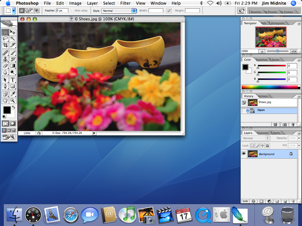
For the construction we used two cameras: a digital stills camera, and a digital video camera. We used both of these cameras for our main project, the video, the stills camera for the flashback photographs and the video camera to shoot the rest. We also used the stills camera for our ancillary tasks. The other hardware we used was an Apple Imac, which I am very familiar with. The software we used to create our products was Final Cut Express, Adobe Photoshop, and Adobe In Design. Two of these programs I was already able to use and quite confident with, as I used them for my AS coursework (Photoshop and In Design). However, Final Cut Express was completely new to me, and took me a while to get to know how to use it. But as we progressed through the construction stage, I learnt more about the software, and how to use it better. For example I learnt how to combine two independent video tracks, to create the photo frame element of the video. To do this, I re-sized the video with the miming in, and placed it inside the photo frame, and then I also desaturated both videos, and used the colour corrector video filters menu to add colour grading to the photo. I used the various controls (blacks, whites, hue, saturation) to make the image look much sharper, which enhanced the overall look. I also added colour grading, again by using the controls in the colour editing screen to enhance the rest of the video. For the photographs, I used the desaturate tool again, so that these linked in well with the photo frame. Some of these also required additional colour grading, which was added in the same way as before. To make the album advertisement, I used Photoshop. I cut out the image of Grace using the pen tool, and creating a separate layer so that I could separate her from the original background. I then used the hue and saturation tools to brighten up the image, and then I used the lightness/darkness tools, and the contrast to sharpen the image. I fiddled around with these until I was happy with the image, once happy, I placed the image into InDesign using file, place, and using the downloaded font, I added the text. To get the correct red colour, I used the colour picker tool, and clicked on the red in the image, to ensure that I had the same colour. I then took the finished album cover and placed this into InDesgin in the same way as before. Once all the information and images were there, I tried many different layouts to see which looked best before choosing the final layout.
We used dafont.com to download a font for our ancillary tasks, called Renaissance. I decided to use this downloaded font instead of the basic fonts such as Times New Roman, as I felt it suited the brand image better, and enhanced the products. We also used the internet to download our song. We used a website of free, uncopyrighted music, and searched through lots of tracks before choosing our final song. Another website we have used is blogger.com, we have used this to post all our resarch, planning, sample photographs, test shoot photographs and all our rough sketches. This has been useful as it has been easy to keep track of our progress in an ordered way, and by doing this online, no information, drawings or images have been lost.
Final Cut Express proved to be a little challenging at times, as I was unsure how to use a lot of the tools at first, and I found it very annoying that footage had to be ‘rendered’ every time you edited bits of it, this slowed down the work process and proved to be very irritating. However, this software didn’t limit creativity, in fact it was the opposite, for example, the colour grading and the photo frame creation discussed earlier would not have been possible on iMovie and other, simpler packages.
Images of the various software:
Above: Final Cut Express editing screen and software package

Above: An example editing screen in Adobe Photoshop and the software package

Above: Adobe In Design, example editing screen and Software package.

This is the photo frame element discussed above.


This is an example of the colour grading
in the video. As you can see, the image is bright and sharp.


This is one of the flashback images, which has been colour graded by using 'Desaturate' and then some brightness and contrast alterations.


A few more stills from our music video:


Finished Products:


Summary
Overall, I feel that our projects have turned out well, and the software we have used has been very useful in developing creativity and enhancing our products. I also think that we have succeeded in creating brand image, and sustaining it throughout all our products.From the AS Foundation Portfolio, my skills have developed and I have been able to produce much more professional results for my A2 Advanced Portfolio.
3365